For the August 25 weekend, the MLB is doing an event to help promote the Little League World Series which has the Championship game on the 27th. For this, they are having a Players Weekend with all new uniforms. With new uniforms, come new caps. While some of the caps are really well done and look quite nice, there are a few that just look awful. As a massive baseball fan that also collects baseball caps, it only felt right to look at the worst the league has to offer. So join me as I take a look at the five worst Players Weekend caps.
5. The Arizona Diamondbacks
Which #PlayersWeekend nickname is your favorite? ? pic.twitter.com/eDDz2W4euF
— Arizona Diamondbacks (@Dbacks) August 9, 2017
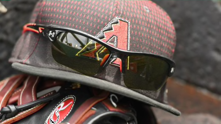
The Arizona Diamondbacks have had a good selection of cap designs over the last two years. This one is not one of them. With the logo on the hat being the tertiary logo, there is just a clash of colors. The darker red of the snake does not go well with the bright cherry red of the hat itself. Along with that the teal on the outline and snake details just look out of place. The logo works fine on a black cap as normally seen but the bright red just makes it look way too bright.
4. The Cincinnati Reds
Bone. Duvy. Wink. See more player nicknames on jerseys during #PlayersWeekend at Great American Ball Park, August 26-27. pic.twitter.com/E1dCrHoZr0
— Cincinnati Reds (@Reds) August 9, 2017
The Cincinnati Reds have a wonderful look for their Player’s Weekend Jerseys but the same can not be said for their caps. Sadly for the Reds, this was the only real direction they could go. The main hat for the Reds is already a C on a red background. When they needed to change it up they went with their creepy baseball logo. The logo has always made friends and me anxious. This logo needed to be left back in the past where it belongs.
3. Toronto Blue Jays
We're excited to officially release our nicknames for #PlayersWeekend on August 25-27!
— Toronto Blue Jays (@BlueJays) August 9, 2017
Check them all out: https://t.co/ohguGzvKuy pic.twitter.com/wlLrbB5dyy
Did you know that the Blue Jays play in Canada? Well, with their new cap, it looks like that is their whole thing. The cap is paired with some nice uniforms, but if they were not out on the field one wouldn’t know they were for a baseball team. The plain Maple leaf on a blue background looks like nothing more than a cap for Canada. It just looks boring. One thing they need to add to the cap is to add the Blue Jay, one of the better baseball logos in my opinion.
2. The Detroit Tigers
We've got our favorites, what are yours?
— Detroit Tigers (@tigers) August 9, 2017
Check out jerseys for this month's #PlayersWeekend ➡️ https://t.co/SZ41kydajZ pic.twitter.com/ShgGyNrdtp
The Tigers have a terrible issue with the caps they chose for the Players Weekend. For some reason, they decided to put a mostly orange logo on an orange cap. The orange, white and baby blue design just looks like a smudge on the cap. While the logo looks nice on black or gray backgrounds it just looks like a mess on orange.
1. Tampa Bay Rays
Flaco Fuerte. Buffalo. Souzbot.
— Tampa Bay Rays (@RaysBaseball) August 9, 2017
See the nicknames our guys picked for Players Weekend later this month.
LIST // https://t.co/8a1gvaRvdJ pic.twitter.com/7KIbRBrkIX
Oh boy, where to begin. The Rays logo that they chose for the hat just makes no sense to me. The design looks good when part of the Rays name but on its own? It looks like a default option in a make your own team mode in a video game. It is done no favors on the hideous lemon yellow cap as well. Even as a massive baseball fan, I was unsure just what this cap was at first glance. The overwhelmingly generic design and the terrible color make it with out a doubt the worst cap for the upcoming Players Weekend.
Check out our ranking on the jerseys and nicknames here.
